![]()
RVS_Spinner Control
This is a special control class that implements a “pop-up spinner” control.
You can associate an array of values with a Spinner, and they will be presented to the user when they tap the center of the control.
The control will pop up either a “fan” of values that can be scrolled like a knob, or a UIPickerView.
It is completely self-contained. You only need to instantiate the control, give it a place in the view (just like any other control), and associate a set of values with it.
The values should be accompanied by images.
The operation and appearance of the Spinner are highly customizable, either at runtime, or through IB Inspectable properties.
WHAT PROBLEM DOES THIS SOLVE?
Mobile devices present difficulties for things like shuttles and pickers. Apple’s UIPickerView is an excellent approach to the problem of dynamic selection, but there are issues.
For one thing, UIPickerViews are BIG. They hog up a lot of precious screen real estate. This is necessary.
Also, they use the DataSource pattern, in which you supply the data at runtime, in a JIT manner. This is an excellent method, but it is rather complex. You sacrifice simplicity for power.
RVS_Spinner is a small icon, until it is touched and expanded. It is also designed to be operated by a thumb.
It also uses a fairly simple Array data provider. Simply associate an Array of structs to the control, and it’s sorted.
WHERE TO GET
As A Swift Package
You can include the Spinner, using the Swift Package Manager, simply by referring to its GitHub Repository URI (SSH: git@github.com:RiftValleySoftware/RVS_Spinner.git or HTTPS: https://github.com/RiftValleySoftware/RVS_Spinner.git).
You will then need to import the module, by adding the following to the source files that will be accessing the spinner:
import RVS_Spinner
Using Carthage
You can install it, using Carthage as your dependency manager.
Simply add the following to your Cartfile:
github "RiftValleySoftware/RVS_Spinner"
That will bring the project into a “Carthage” directory.
You should probably add the single file from the project (as opposed to the product). That can be found in “Checkins”.
If you do that, then no need to import.
If you include the product (in the “Build” subdirectory), you will need to import the module, by adding the following to the source files that will be accessing the spinner:
import RVS_Spinner
Note that Carthage may not sign the module, and you may have issues submitting it.
Directly From GitHub
Here is the GitHub Repo for This Project.
Since the entire control is contained in only one file, you also have the option of simply grabbing that source file (the RVS_Spinner/RVS_Spinner.swift file), and just including that in your project; in which case, you won’t need to import the module.
In fact, I’d actually suggest doing this. I’m not a huge fan of “live” dependencies (I usually “snapshot” code dependencies and include them in the project repo), and it will actually slightly reduce overhead.
Here is the online documentation page for this project.
REQUIREMENTS
The Spinner is provided as a Swift-only static library (or dynamic framework), supporting iOS 13.0 and above.
This is meant for iOS (UIKit) only.
DEPENDENCIES
There are no dependencies to use this class in your project. It can be included as a single source file (no build or library linking required).
OPERATION
RADIAL SPINNER
The way it works, is that the “quiescent” control is small. By default, it is an oval or circle; possibly with an image or text in it, or just an image.
Tapping on this image “pops up” a surrounding ring of images, which can be rotated about the center, like a prize wheel or a knob.
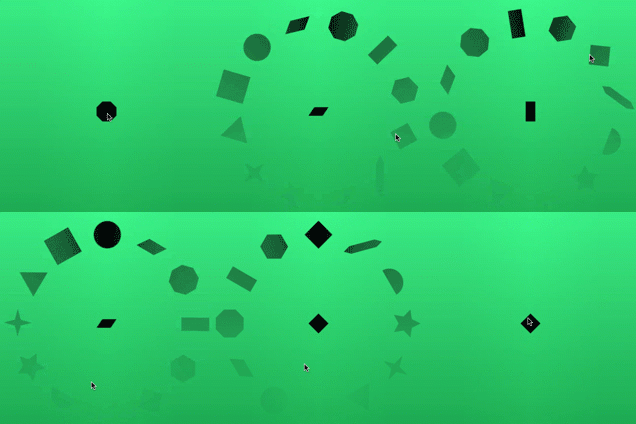
This popup is a UIControl that is opened in the superview of the control, so the superview (the control’s container) must be able to support having a larger view added. This container will constrain the size of the control, when it pops up.
You can prescribe the radius of the popup or UIPickerView at runtime, or in the Interface Builder/Storyboard Editor. The sizes of the images will adjust to fit the circle.
You can control the open Spinner with gestures. It was designed to be thumb-controlled; including a “prize wheel” spinner, where you can send the control spinning in a decelerating rotation. The top (most visible) value is the one that will be selected. Tapping in a spinning control will stop it. You can also single-tap on either side of the open control to advance (decrement) the control by one.
PICKER VIEW VARIANT
You can also have a standard UIPickerView come up, which may be better for larger numbers of values, or for developers that prefer a more standard Apple User Experience.
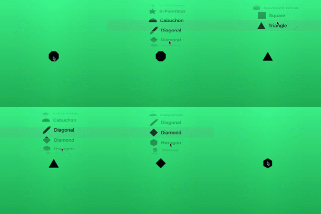
IMPLEMENTATION
To use RVS_Spinner in your project, import the framework into your Swift 4.0 or above project. The main Spinner class is called “RVS_Spinner,” and you can use this class in storyboards.
Unlike the UIPickerView, the Spinner is self-contained. You supply it an Array of RVS_SpinnerDataItem instances, which contain, at minimum, an icon (a UIImage), and a title (a String). These are displayed by the Spinner when it is opened (the spinner variant displays only icons, but the picker variant displays both).
The Spinner has a RVS_Spinner.selectedIndex property that denotes which Array element is the selected value.
In order to use this in Interface Builder/Storyboard Editor, you need to drag in a UIView, then make it an instance of RVS_Spinner. The module will be “RVS_Spinner” (if you used the framework).
INTERFACE BUILDER/STORYBOARD EDITOR OPTIONS
Once you assign the RVS_Spinner class to the UIView, a number of options will appear in the Attributes Inspector for the Spinner:
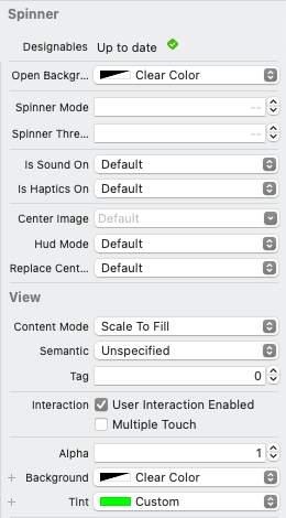
Open Background Color This is a color to display behind the open radial spinner or picker. By default, it is clear.
Spinner Mode This is an integer, with 3 values:
- -1 Use only the radial spinner (ignore the Spinner Threshold value).
- 0 Switch between radial spinner and the picker (based on the Spinner Threshold value). This is default.
- 1 Use only the picker (ignore the Spinner Threshold value).
Spinner Threshold This is an integer, from 0 to whatever value you wish, that represents the point at which an
Arrayof values switches from the radial spinner to the picker. This only applies when the Spinner Mode option is set to 0 (both).Is Sound On This specifies whether or not to use audible feedback. Sound will be disabled when the Alerts (ringer) setting is off.
Is Haptics On This specifies whether or not to use haptic feedback (on devices that can play haptics).
Center Image This allows you to specify a fixed image to be displayed in the center. If the image is template mode, it will be drawn with the
UIView.tintColorproperty. Default means that the center image will use the image of the selected value.Replace Center Image This is only effective if “
centerImage” is applied. If set to True (ON), then, when the control is opened, the explicitly-assigned center image will be replaced by the current value icon. Closing the control will replace the icon with the assigned center image.Hud Mode If this is set to ON (default is OFF), then the control will render in “HUD Mode,” where the backgrounds will be clear, and no borders will be drawn around the images.
Additionally, the View Background Color color is used to establish the color surrounding icons, and the Tint color is used to set the color of the borders around icons, and displayed text in the picker. If the image is template mode, it will be drawn with this color.
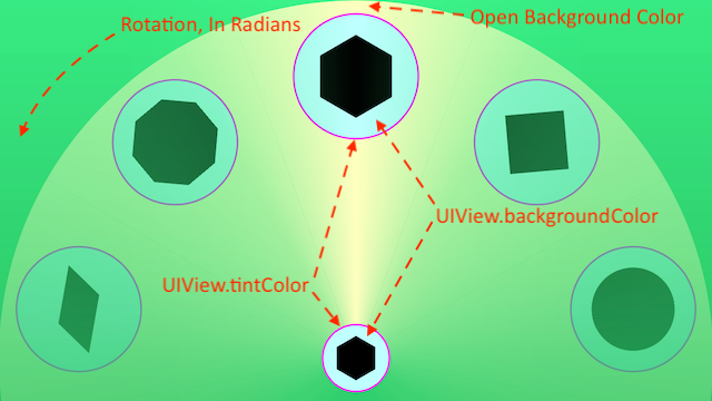
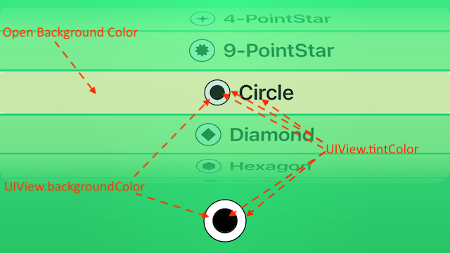

If the UIView Background Color is clear, and the UIView Tint is clear, the icons will be displayed slightly larger, with no surrounding ring (BTW: You can change the shape of the ring programatically. Circle/Oval is default).
If the Tint is clear, then the UIPickerView text will be black.
PROGRAMMATIC OPTIONS
One important part of the usage of RVS_Spinner is applying an Array of RVS_SpinnerDataItem instances.
This is a struct that contains an icon for display (a UIImage) and a String (the title of the image). You can also optionally attach a more detailed description String to the data item.
In the spinner popup, only the image is shown, but in the PickerView variant, the text is also shown. Setting the text to “” will show only the image in the picker.
You can also attach any arbitrary data item to an instance of RVS_SpinnerDataItem. There is a property called value, which is an Any? property. You can associate any data that you want with an RVS_Spinner data item. Selecting the RVS_Spinner.value calculated property of the RVS_Spinner instance will return the entire selected data item. These are value types, and not reference types.
You need to provide this array programmatically. You assign it to the RVS_Spinner.values property, and the data will be immediately available to use.
ROTATION
You can rotate the control, and the center can compensate. There is a property, called “isCompensatingForContainerRotation,” that will force the icon in the center to always be vertical, despite the rotation of the control. By default, this is true. Setting it to false will cause the center icon to rotate to match the control rotation.
You should not rotate the control. Instead, you should rotate the enclosing view (the one that constrains and defines the open spinner and picker). This ensures that all gestures are also rotated properly.
Rotation should be done programmatically, by setting the transform property of the spinners’ superview.
CODE SAMPLE
Here is an example code snippet (from the Test Harness app):
First, we set up the data array to be set to the control:
func setUpDataItemsArray(_ inNumberOfItems: Int) {
    _dataItems = []
    let items = subsetOfShapes(inNumberOfItems)
    items.forEach {
        _dataItems.append(RVS_SpinnerDataItem(title: $0.name, icon: $0.image, value: _associatedText[$0.index]))
    }
    setUpSpinnerControl()
}
Note the value: _associatedText[$0.index]. This is how we associate arbitrary data to data items. In this case, the data are simple String instances, but they can be anything that you like. Remember that the data array is a value type, and not a reference type.
func setUpSpinnerControl() {
    spinnerView.values = _dataItems
    spinnerView.selectedIndex = _dataItems.count / 2
    spinnerView.backgroundColor = _colorList[innerColorSegmentedControl.selectedSegmentIndex]
    spinnerView.tintColor = _darkColorList[borderColorSegmentedControl.selectedSegmentIndex]
    spinnerView.openBackgroundColor = _colorList[radialColorSegmentedControl.selectedSegmentIndex]
    spinnerView.delegate = self
}
Note the spinnerView.delegate = self. This is because the test harness UIViewController applies the RVS_SpinnerDelegate protocol.
DELEGATE
The spinner uses a Delegate pattern to interact with the implementation. You can choose to use the control without assigning a delegate, but having the delegate allows greater interaction and reactiveness.
In order to be a delegate, you should assign RVS_SpinnerDelegate as a base protocol for your class. Your class does not have to be a @objc class. The delegate protocol is a pure Swift protocol (Which is also why you can’t assign the delegate in Interface Builder).
The RVS_Spinner class does send out traditional UIControl Target/Action events. In particular, UIControl.Event.valueChanged and UIControl.Event.touchUpInside. You can listen for these events. The spinner variant will send UIControl.Event.valueChanged out continuously while spinning, while the picker variant won’t send them out until it finishes its scroll.
UIControl.Event.touchUpInside is called when the center of the control is tapped to open, close or behave like a button.
SUBCLASSING AND MODIFICATION
It is possible to subclass and extend RVS_Spinner.
You can also modify all types of other things. RVS_Spinner was designed as a “baseline” control.
You can modify the font used to display the title strings in the picker variant by setting a new value to the RVS_Spinner.displayFont property.
USAGE
A lot has already been covered, here, and the test harness app will help to show some real-world implementation, but you change the selected index (which item is selected as the current value) by altering the 0-based index in RVS_Spinner.selectedIndex. RVS_Spinner.value cannot be set. It is a read-only property.
BASIC TEST HARNESS APP
The basic test harness target imports the compiled framework, so it does provide a real-world application of RVS_Spinner.
This application gives access to a lot of the “knobs and buttons” for the spinner.
It is a simple 1-view app, with a single window:
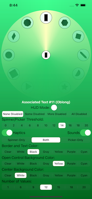
The controls operate in real time on the instance of RVS_Spinner, displayed above the control panel:
The white “Associated Text #XX (XXXXX)*” is a label that displays test data that was associated with each of 20 data items used for testing. The value property of each item was set to a String, which is displayed as that item is selected.
The “Disabled Items” Segmented Switch will affect the “isEnabled” property of individual items, at random.
The “Spinner/Picker Threshold” Segmented Switch will affect the “Spinner Threshold” property, described above. It is only enabled for the “Both” Spinner Mode (discussed below)
The “Haptics” and “Sounds” switches control whether or not each of those properties is on. Default is on.
Below that, is the “Spinner Mode” Segmented Switch. If “Spinner-Only” is selected, then the control will ONLY pop up with a spinner; regardless of how many values are provided in the values array property. The “Spinner/Picker Threshold” Segmented Switch is disabled if this is selected.
If “Picker-Only” is selected, then only the Picker will be displayed. The “Spinner/Picker Threshold” Segmented Switch is also disabled.
If “Both” is selected, the “Spinner/Picker Threshold” Segmented Switch is enabled, and describes a number of values that change the behavior of the RVS_Spinner instance from a spinner popup to a picker popup.
The “Border and Text Color” Segmented Switch has some presets that are applied to the UIView.tintColor property.
The “Open Control Background Color” Segmented Switch affects the “Open Background Color” property, discussed above.
The “Center Background Color” Segmented Switch affects the UIView.backgroundColor property, and affects the filler of the central circle, as well as any “frames” around the icons in an open control.
The “Number of Values” Segmented Switch applies a subset of up to 20 available values to the control. If “1” is selected, then the control will not pop up, but will behave somewhat like a regular UIButton.
The test harness app is deliberately simple, and should provide an excellent “starting point” for using the RVS_Spinner.
SIMPLE EXAMPLES
There are two simple examples, featuring the test harness app, that show how to implement the RVS_Spinner into your project:
- Here is an example using Swift Package Manager
- Here is an example, where we directly import the source file
These links will download .zip files, which expand into small project directories.
TABBED TEST HARNESS APP
There is another test harness app that uses a tabbed layout to show the control in a few different scenarios, using tricky auto-layout techniques.
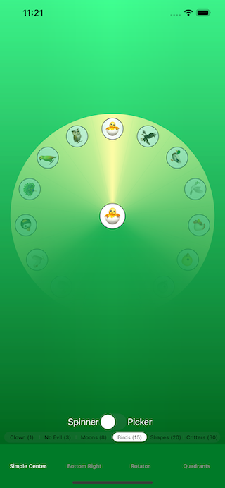
The first tab is a simple centered control. You can choose the dataset to use, and whether or not it is forced as a spinner or picker.
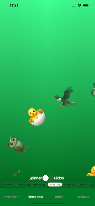
The second tab is a control that is crammed all the way into the bottom right corner, and is rotated 45 degrees counter-clockwise.
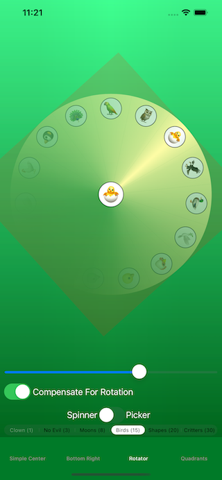
The third tab demonstrates rotation. The slider controls the rotation, and the enclosing view is shown as a slightly darker square.
The above image shows rotation compensation on. Note that the center icon is vertical, despite the fact that the control is rotated.
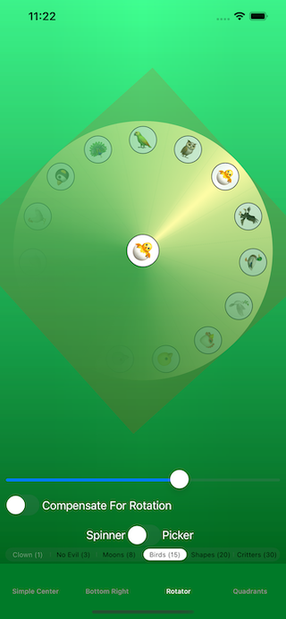
This image shows rotation compensation off. Note that the icon in the middle is now tilted.
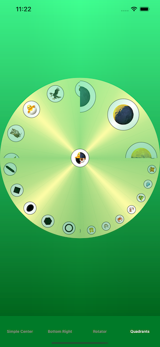
The fourth tab is a bit crazy. It’s four independent controls, broken into quarters of the screen, and each rotated 45 degrees off the plane, but mortised together in the middle.
LEAK TEST HARNESS APP
There is a small, simple app that lives for only one thing: to be run in “Profile” mode, and let the framework be examined for things like memory leaks.
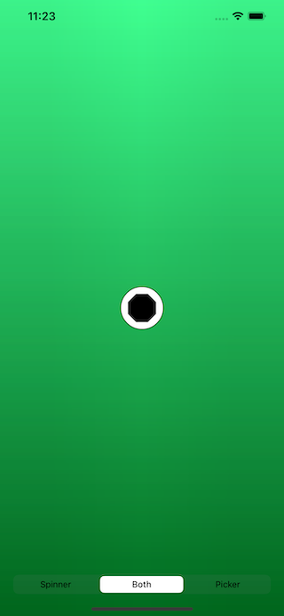
HUD MODE TEST HARNESS APP
This is a newer app that simply tests and demonstrates the new (since version 2.4.0) HUD Mode, and Center Image.
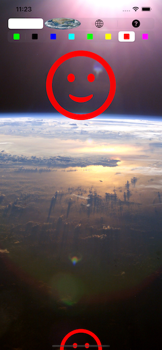
The “Center Image” Segmented Switch allows you to change the center image.
The “blank” segment means that no center image is specified. That means that the center image is determined by the selected value. In this case, it will be displayed in template mode, so it will be colored by the UIView.tintColor property.
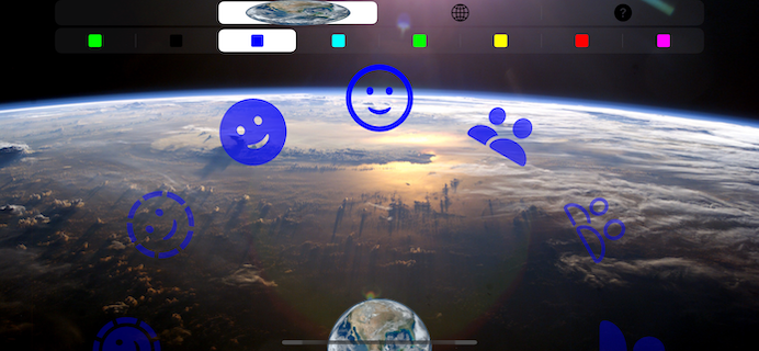
The “Earth” segment will make the center image an “original mode” image (a photo of Earth from space). This will also implement the “Replace Center Image” option.
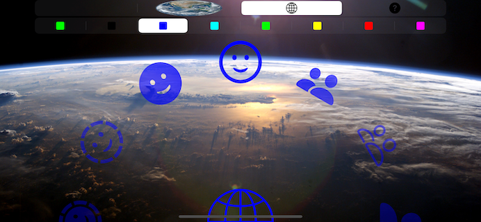
The “Globe” segment will make the center use a template mode image from the resources.
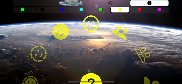
The “Question Mark” segment will use an auto-generated image from the system’s SF Symbols (template mode).
The “Highlight Colors” Segmented Switch allows you to change the UIView.tintColor property.
LICENSE
MIT License
Permission is hereby granted, free of charge, to any person obtaining a copy of this software and associated documentation files (the “Software”), to deal in the Software without restriction, including without limitation the rights to use, copy, modify, merge, publish, distribute, sublicense, and/or sell copies of the Software, and to permit persons to whom the Software is furnished to do so, subject to the following conditions:
The above copyright notice and this permission notice shall be included in all copies or substantial portions of the Software.
THE SOFTWARE IS PROVIDED “AS IS”, WITHOUT WARRANTY OF ANY KIND, EXPRESS OR IMPLIED, INCLUDING BUT NOT LIMITED TO THE WARRANTIES OF MERCHANTABILITY, FITNESS FOR A PARTICULAR PURPOSE AND NONINFRINGEMENT. IN NO EVENT SHALL THE AUTHORS OR COPYRIGHT HOLDERS BE LIABLE FOR ANY CLAIM, DAMAGES OR OTHER LIABILITY, WHETHER IN AN ACTION OF CONTRACT, TORT OR OTHERWISE, ARISING FROM, OUT OF OR IN CONNECTION WITH THE SOFTWARE OR THE USE OR OTHER DEALINGS IN THE SOFTWARE.
The Great Rift Valley Software Company: https://riftvalleysoftware.com
 View on GitHub