 View on GitHub
RVS_RetroLEDDisplay
A Simple, Classic, Customizable Digital Display.
Overview
This is a UIKit widget that displays a “classic” LED display (seven-segmented, simple digitital display). It does this by displaying a customizable background through a mask that simulates the “look and feel” of an old-fashioned LED display.
This is designed as an “aesthetic” widget, for use by apps that want to mimic “old time” displays, and want a bit more realism and customization than can be provided by “digital” fonts.
That said, a font gives you a great deal of flexibility, when it comes to content, and you may find The RVS_MaskButton module interesting, as well. RVS_MaskButton is not quite as customizable as this widget, but does allow you to use any font you want, in a very similar manner.
You can specify the widget as a set of horizontally-connected digits, and treat it as a “whole,” with the ability to change the radix (numbering base) of the display.
This widget is strictly for displaying old-fashioned LED digits.
It uses vector drawing, so does not require resources.
What Problem Does This Solve?
This widget was designed specifically for the rewrite of The AmbiaMara Timer App. That app presents a classic “Vacuum Fluorescent”-style display.
Find Out More
The following screengrabs are from the Test Harness Project, included with this package.
It’s possible to use images and gradients to offer a lot of custom appearances:
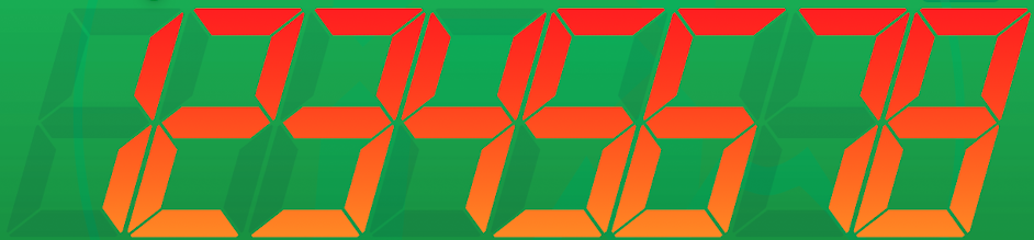
| Figure 1: Standard Appearance | Figure 2: With Gradients |
|---|---|
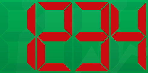 |
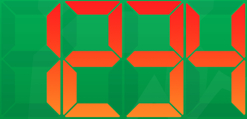 |
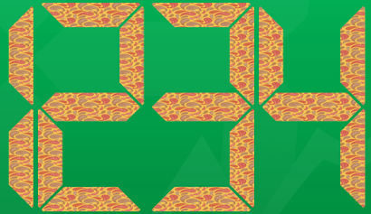
| Figure 3: Images In the “Active” Segments | Figure 4: And Also In the “Inactive” Segments |
|---|---|
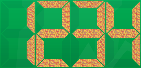 |
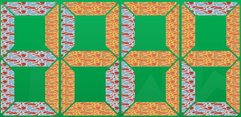 |
And you can also have blank “inactive” segments, and apply a “skew” of the display:
| Figure 5: Blank “Inactive” Segments | Figure 6: Skewed to the Right | Figure 7: Skewed to the Left |
|---|---|---|
 |
 |
 |
| Figure 8: A Long Skew |
|---|
 |
Requirements
Swift-Only UKit Module
The module is a Swift-only Swift Package Manager (SPM) module. It is a UIKit widget.
Dependencies
The image class, itself, has no dependencies, but the test harness depends on the RVS_Generic_Swift_Toolbox module.
The test harness also uses a couple of pattern images derived from Paisley Patterns, by ilonitta. These are not required to use the package.
Usage
Where to Get
In order to use this class, you should install it as a Swift Package Manager (SPM) module.
You can use SPM to load the project as a dependency, by referencing its GitHub Repo URI (SSH: git@github.com:RiftValleySoftware/RVS_RetroLEDDisplay.git, or HTTPS: https://github.com/RiftValleySoftware/RVS_RetroLEDDisplay.git.
Once you have installed the module, you should include it in the file that will need to access it, like so:
import RVS_RetroLEDDisplay
You can initialize via the Storyboard Editor, or directly, programmatically.
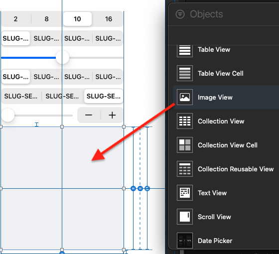
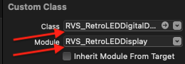
Storyboard Editor Setup
You start by dragging in an Image View (UIImageView), then setting the class and module to RVS_RetroLEDDisplay:
| Figure 9: Dragging In the Object As A UIImage | Figure 10: Setting The Class And Module | Figure 11: The Inspectable Properties |
|---|---|---|
 |
 |
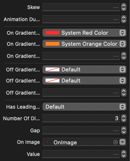 |
Programmatic Setup
You can simply initialize an instance of RVS_RetroLEDDisplay, as you would an instance of UIImageView. If you initialize it with an image (setting the image property), then that image will be used as “fill” for the “inactive” segments.
You can also supply an image for the “active” segments of the display, by setting the onImage property.
If you do not supply an image, then you can specify colors (including a gradient), to be used in the display.
The “active” and “inactive” backgrounds are independent of each other. You could, for example, have a gradient for the “inactive” segments, and an image for the “active” segments.
It can also have a “skew” applied, that gives it the classic “lean” of LED digital displays.
Animation Duration In Seconds
This allows you to specify a brief “fade” animation, when changing values (makes it behave more like a “classic” LED). If you leave it at default, it is less than a quarter-second. Set it to 0, to disable the animation.
Radix (Numbering Base)
The widget supports Base-2 (Binary), Base-8 (Octal), Base-10 (Decimal), and Base-16 (Hexadecimal) numbering systems. You tell it what to use by setting the radix property.
Value
The widget value is an Integer (signed). It will be displayed in whatever radix has been set for the widget. Additionally, the value will be clipped at the maximum displayable, depending on the radix, and number of digits.
You set the value, via the value property.
-1 and -2 are special values:
- -2 means that no segments will be active. Only inactive segments will be shown (“blank” display).
- -1 Means that a minus sign (-), for single-digit displays will be shown, or a line of minus signs, for multiple-digit displays.
Negative numbers are not displayed. In order to display a negative number, you should place a single digit widget in front of another widget that is to display numbers, and have that display a -1 value.
Skew
“Skew” is the “slant” of the widget. It is set by setting the skew property (floating point) to a value in the range of -1...1. Zero means no skew. Negative means “lean left,” and positive means “lean right.”
Number of Digits
You can specify how many digits will be available in the widget. These will be treated as a display of a numeric value, bound by the radix, and the number of available digits. The minimum is 1, and there is no upper limit (but don’t get too crazy. This is a signed integer, so there are limits).
You specify the number of digits by setting the numberOfDigits property.
NOTE You may want to be careful about the order in which you set these values. For example, if you start with two digits, in base 16, you will not be able to set a value of 256 (100 hex), until you have increased the digit count to 3 (or more). Also, the radix property will affect the maximum value. For example, if the value is 255 (FF hex), and the radix is Base 16, switching the radix to Base 10, without increasing the number of digits, first, will truncate the value to 99.
Appearance
When changing the colors, the presence of an image supersedes any colors in the gradient start and end slots.
If you want to have a solid color, you can use a small image, scaled out, with a solid color, or you can define only a start color for the gradients.
The Test Harness Project
The Test Harness is a very simple, 1-screen app, with a number of controls, designed to stimulate the various aspects of the widget.
| Figure 12: The Test Harness App |
|---|
 |
The controls are (top to bottom):
Radix
The top segmented switch changes the numbering base of the widget. The choices are:
- 2 (Binary)
- 8 (Octal)
- 10 (Decimal)
- 16 (Hexadecimal)
Active Segment Fill
The second from top segmented switch controls the fill for “active” segments. The choices are:
Default
This uses a simple, 1-color image to fill the segments. It is visually identical to setting a solid color.
Ugly
This applies a paisley pattern image.
Gradients
This applies a red-to-orange gradient.
Solid
This uses a single color, specified in the gradient properties (just the start).
Gradient Angle
This is only enabled when one (or both) of the fill switches is set to “Gradients.” It allows you to change the angle the gradient fills.
Inactive Segment Fill
This is almost exactly like the Active Segment Fill Switch, but uses different colors/patterns.
Aspect
This applies different aspects to the control. The rightmost one (“Normal”), uses the
idealAspectproperty to determine the optimal aspect for the control display. The leftmost one, rotates that by 90 degrees (π/2).Value Slider And Stepper
This allows you to change the value, sent to the widget. The stepper allows 1-by-1 value changes. The leftmost two values are -2, and -1, respectively. The maximum is the maximum available for the control, given the radix and the number of digits.
The Widget
This is the Code Under Test. It displays the widget, according to the current settings.
Skew
This slider allows you to skew the widget.
Number of Digits
This sets the number of digits displayed. The choices are 1, 2, 4, and 8.
Leading Zeroes
This switch will turn “leading zeroes” on and off.
Find Out More
The package has full DocC support, so it should integrate perfectly into your project.
This is the technical documentation for the package. It discusses the exposed public API, and the various properties that you can access.
This is the Test Harness Project. It has been designed as a simple project, and should provide excellent guidance in use of this package.
Legal
Attribution required for usage of Paisley Patterns, by ilonitta
These patterns are only used in the Test Harness, so no attribution is required for use of the package.
MIT License
Permission is hereby granted, free of charge, to any person obtaining a copy of this software and associated documentation files (the “Software”), to deal in the Software without restriction, including without limitation the rights to use, copy, modify, merge, publish, distribute, sublicense, and/or sell copies of the Software, and to permit persons to whom the Software is furnished to do so, subject to the following conditions:
The above copyright notice and this permission notice shall be included in all copies or substantial portions of the Software.
THE SOFTWARE IS PROVIDED “AS IS”, WITHOUT WARRANTY OF ANY KIND, EXPRESS OR IMPLIED, INCLUDING BUT NOT LIMITED TO THE WARRANTIES OF MERCHANTABILITY, FITNESS FOR A PARTICULAR PURPOSE AND NONINFRINGEMENT. IN NO EVENT SHALL THE AUTHORS OR COPYRIGHT HOLDERS BE LIABLE FOR ANY CLAIM, DAMAGES OR OTHER LIABILITY, WHETHER IN AN ACTION OF CONTRACT, TORT OR OTHERWISE, ARISING FROM, OUT OF OR IN CONNECTION WITH THE SOFTWARE OR THE USE OR OTHER DEALINGS IN THE SOFTWARE.